

A long time ago (well, 2022) I had a very brief debate with Noah Smith about the use of GDP per capita as a stand-in for living standards. We were discussing the Dominican Republic, which has seen very rapid economic growth in recent years. Living standards, however, have lagged the D.R.’s rapid GDP growth. I wrote an entire post exploring the reasons for that lag — and criticizing the shorthand use of GDP per capita. Now, to be fair to Dr. Smith, in another piece he explicitly warned people to avoid being “too obsessed with one single measure.” But he also called per-capita GDP “a great measure of living standards for developing countries” and used Argentina as one of his examples.
I respectfully disagree. The problem with GDP per capita is particularly acute when you use it to compare countries in the past, something especially relevant when you’re talking about Argentina. When did the country fall behind? Its GDP per capita, for example, rivaled Canada until the Canadian economy shot ahead during the Second World War:
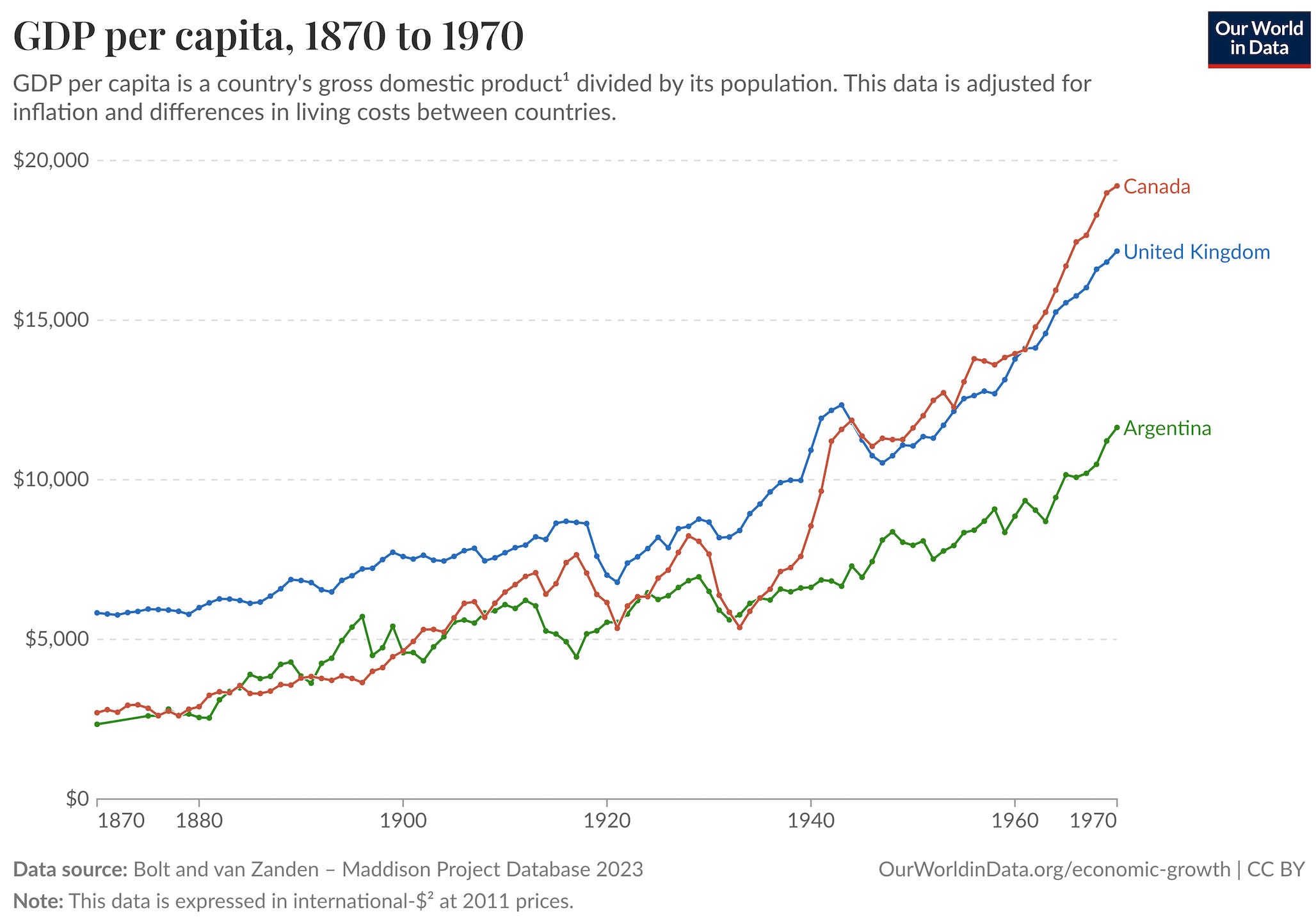
But waitasecond — this chart also shows Canada lagging Great Britain, and lagging a lot, for most of the period before the war. In 1871 (a census year in both countries) its GDP per capita was only 48% of the mother country; by 1911 (another census year), it was still only 85%.
How can that be? Were Britons actually as well off as Canadians? Was the attraction of transatlantic settlement a myth, or perhaps something undertaken only by the most desperate Englishmen? Or are the GDP numbers simply wrong?
So even though Argentina motivated the question, Canada gets the rest of the post.
Reconciling the numbers
Well, let’s try an easy adjustment first. Canada had a younger population than Britain and a correspondingly lower labor force participation rate (LFPR). Well, the U.K.’s LFPR can be calculated from Tables 55 and 57 in National Income Expenditure and Output of the United Kingdom, 1855-1965. Equivalent Canadian data for 1871 is available from Table L-III on page 93 of Censuses of Canada: 1608 to 1876.1
In 1871, only 29% of the total Canadian population was in the labor force, against 44% for the U.K. By 1911, the Canadian number had risen to 39%, whereas the British number remained the same. That closes some of the gap: Canadian output per worker in 1871 is 73% of the British level, rising to 92% by 1911.
Still, that doesn’t seem right. Every contemporary observer will tell you that living standards were higher in Canada than in Britain at this time. So what else can we do to close the gap between these numbers and the evidence of millions of lying eyes?

Well, Canada wasn’t one thing back then. (It still isn’t.) The Dominion was split into provinces. Ontario was the richest. If you take the 73% of Britain for all of Canada at face value and assume the same PPP adjustment for all four provinces, then Ontario’s output per worker (using Table 1 from Inwood and Irwin (2002) and dividing by the provincial labor force on page 93) would be about 83% of the British level, against 72% for Quebec, 53% for New Brunswick, and 49% for Nova Scotia.2
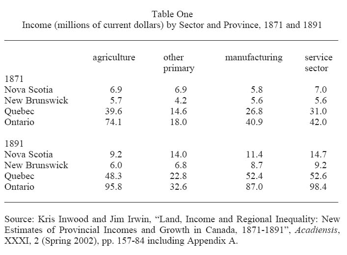
Now we’re getting somewhere! No contemporary observers thought that the Maritimes or rural Quebec (but not Montreal!) was anything but poor. Canadian prosperity at that time meant Ontario (or the very sparsely populated prairies).
Still, while 83% is a lot higher than 48%, it’s still a noticeable gap. Ontario should have appeared noticeably poorer compared to the motherland, but that was precisely nobody’s impression in the 1870s. So there’s gotta be something else.
And what do you know? There just might be three things that could get us the rest of the way without having to rejigger the numbers. In fact, we really only need one of them. If Ontarian workers received a greater share of output in Canada than in Britain — plausible in a labor-scarce economy — then they could be less productive and still receive higher wages.
For Ontarian real wages to equal Great Britain (sans Ireland), the share of income going to workers would need to be roughly one-fifth greater in Canada than in the U.K. Well, in 1873, the estimate is that wages came to 41% of total national income in Britain.3 That’s actually fairly low by international standards. For wages to be the same in Ontario as in Britain, Canada’s wage share would have to be only 50%, which is still relatively low. For wages to be 40% higher in Ontario (as implied by the data on urban wages gathered by Jeff Williamson), the wage share would have to be 70%.
A 70% wage share is too high to be reasonable. A 55% wage share, however, would make Ontario’s labor market look like the United States and generate real wages a full ten-percent higher than in Britain. A high (but not crazily so) wage share of 60% would generate real wages about 20% higher in Ontario than in Britain. (The arithmetic is Ontario’s estimated output per worker relative to Britain, multiplied by the ratio of the Canadian and British wage shares: 0.83 × (0.55 ÷ 0.41) = 1.11 and 0.83 × (0.60 ÷ 0.41) = 1.21.) That’s more than enough to jibe with contemporary observations.
I did mention two other things might help get us there, no? Remember that in Britain most of that capital income was going to the owners of the satanic mills or the landed gentry. In Canada, most of it would be going to prosperous yeoman family farms. And with the Dominion government’s wise 1872 decision to copy America’s Homestead Act, landowning got more democratic still. In other words, capital income was almost certainly distributed more evenly in Canada than in Great Britain.

In addition, it’s quite plausible that the wage distribution was more equal in Canada than in Britain, which means that the median Canadian worker could enjoy a higher standard of living relative to the median British laborer than the average GDP-per-capita would imply.
So what do we have? Williamson’s wages could be wrong; perhaps Canada’s real wages were only 20% higher rather than 40% higher. Or perhaps the Maddison GDP statistics might be wrong, and Canada’s GDP per capita was 20% higher than indicated. But even without assuming either of those two things, we’ve shown that Canada could have had a GDP per capita only half of Great Britain’s and still enjoy generally higher living standards.
Tying the score without moving the goalposts
Here’s how we reconciled higher Canadian living standards with a much lower GDP per capita, without taking issues with any of the published data, step by step:
Start with the Maddison numbers. They put Canadian GDP per capita at 48% of the British level in 1871 and 85% in 1911.
Adjust for Canada’s lower labor force participation rate. That raises implied Canadian output per worker to 73% of Britain in 1871 and 92% in 1911.
Break the Canadian average into provinces. In 1871, implied output per worker rises to about 83% of Britain in Ontario, while Quebec, New Brunswick, and Nova Scotia pull down the national average.
Allow Canadian workers to receive a larger share of output. With Britain’s wage share at 41%, an Ontario wage share of 55% to 60% would generate real wages about 10% to 20% above Britain in 1871 despite lower output per worker. We stop the quantitative analysis here.
Account for a broader distribution of capital income. In Ontario, much of that income went to family farmers rather than a small class of landlords and industrialists, so it was spread more equally than in Britain.
Account for a more egalitarian wage distribution.
In other words, the combination of a younger population, a richer Ontario, a larger labor share, and more broadly distributed capital income could leave Canadians with higher living standards even if national GDP per capita was only about half the British level.
Now, in fact one of my favorite economic historians, John Devereux (City University of New York), avers that there actually is measurement error in the Maddison estimates. The Maddison numbers try to account for price differences between countries, but they don’t use historical benchmarks to re-update the numbers. Ward and Devereux do, and they find that Canada’s price-adjusted GDP per capita was closer to 75% of the British level in the early 1870s, not 48%. Nonetheless, it is possible to reconcile the Maddison number with higher living standards — which shows you just how misleading GDP per capita can be as a measure of a country’s overall economic well-being even when the data are properly measured.
Moral: one number can’t do all the work
What was that saying? There are lies, damned lies, and statistics? Well, Canada’s relative standing in the late 19th century is a case of the latter. Without assuming any data errors at all, the relative GDP per capita data give an image of a 19th-century Canada as crushingly poor as Ireland or Italy, before suddenly taking off at the turn of the last century. But while it is certainly true both that Quebec was relatively poor (see Vincent Geloso) and that Canada hemorrhaged people to the United States, it is not true that the place was as desperately poor as Ireland or Italy.4
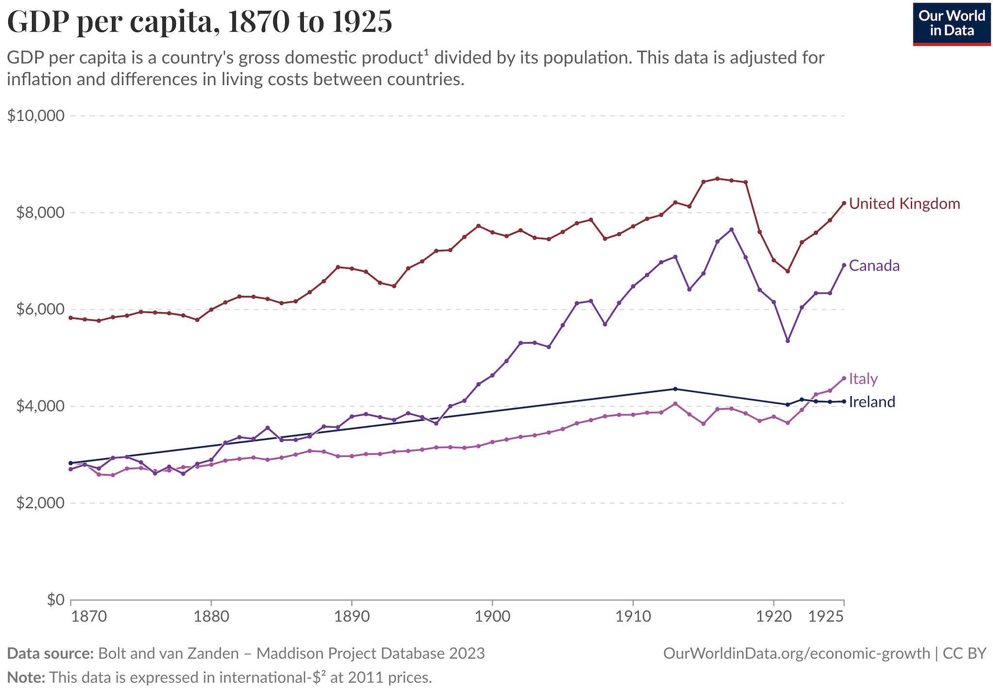
Canada was supposed to be the easy comparison! Instead, it showed why it’s harder than it looks to pinpoint exactly when (or even if) Argentina fell behind. GDP per capita mixes together labor-force participation, factor shares, regional differences, wage and capital income distributions, and price indices, any one of which can distort the picture as seen by actual people living the economic differences. In this case, Canada could quite easily have had a GDP per capita much lower than Britain, down around Italy or Ireland, while simultaneously offering immigrants from all three countries a far far better standard of living.
So let’s be clear: Canada was much richer than Italy in the 1870s! Oh, it looked bad compared to the United States, but come on, everybody did. Similarly, Canada’s GDP per capita was lower than Britain’s, but that did not mean what the headline figures would make you believe that they meant.
So before declaring that Argentina matched Canada and then suddenly fell behind during World War II, later posts will try to analyze Argentina the same way. It’ll be slow going — this is ongoing research. But if we really want to understand what the heck happened in the Southern Cone — did Argentina really fall behind Canada; if so, when; and either way why did it end up poorer — there’s no substitute for doing the hard work. Traipsing through downloadmydata.com (or asking an A.I.) just won’t do it.
In 1871, Manitoba, B.C., and the Northwest Territories had a population of only 109,000 people and were not included in the census. Luckily, that’s a rounding error in a country of 3.5 million. Prince Edward Island (pop. 94,000) didn’t join Canada until 1873.
These numbers jibe with later estimates from Appendix B of Alan Green’s seminal work, Regional Aspects of Canada’s Economic Growth (1971).
Robert Matthews, C. H. Feinstein, and John Odling-Smee, British Economic Growth, 1856-1973: The Post-War Period in Historical Perspective (Stanford: 1982), Table 6.1. The data exclude “Southern Ireland,” which was part of the U.K. at the time.
I cannot recommend the work of Vincent Geloso more highly. First, he finds that colonial Quebec was already poorer than British North America. Second, he finds that there is no evidence that the British conquest slowed Quebec’s economic growth; rather, the problem lay in the seigneurial system — by the 1840s, it was much poorer than English-speaking North America. Finally, the big break happened with World War II more than the Quiet Revolution. It’s great stuff! He should write a book.
Modern day Panama's gdp per capita/ppp has Ireland like distortions, but I still see people not take this into account.